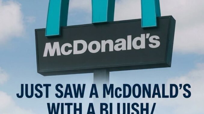
The Town That Painted the Golden Arches Turquoise
If you ever find yourself driving through the breathtaking, sun-drenched landscapes of northern Arizona, you will quickly realize that the town of Sedona is unlike almost any other place in America. Famous across the globe for its towering red sandstone formations, serene desert vistas, and reputation as a hub for art and spiritual wellness, Sedona has spent decades fiercely protecting its pristine environment.
Yet, nestled within this carefully preserved natural sanctuary sits a global anomaly: a McDonald’s restaurant featuring a cool, desert-themed turquoise logo instead of its legendary golden arches.
For decades, the bright yellow “M” has stood as one of the most universally recognized corporate symbols on Earth. Whether you are in Tokyo, Paris, or New York, those golden arches promise familiarity and fast service. However, in Sedona, corporate uniformity had to take a backseat to local preservation. The resulting turquoise arches have transformed an ordinary fast-food joint into a must-see landmark for travelers from all over the world.
The Birth of a Strict Design Code
The story behind Sedona’s famous blue-green arches is not a clever marketing campaign or a temporary promotional stunt. Instead, it is the direct result of strict local government regulations and a community-wide dedication to environmental aesthetics.
When Sedona officially incorporated as a city in 1988, local leaders and residents were deeply concerned about the threat of rapid commercialization. They feared that flashy neon signs, towering billboards, and bright, mismatched corporate colors would ruin the stunning views of nearby landmarks like Cathedral Rock and Bell Rock.
To prevent this, Sedona established rigorous building codes and architectural guidelines. The rules dictated that:
-
All commercial structures must blend seamlessly into the surrounding desert.
-
Buildings must use low-profile designs that do not block mountain views.
-
Color palettes must be limited to earth tones, such as terracottas, sage greens, and deep browns, to complement the natural red rocks.
When a Global Giant Met Local Regulations
In the early 1990s, franchise owner Greg Gerrard sought to open a McDonald’s location along Sedona’s main highway, State Route 89A. When the development plans were submitted, city planners immediately raised concerns about the brand’s iconic corporate identity.
Local officials argued that the classic, vibrant yellow sign would clash aggressively with the deep, warm hues of the surrounding landscape. At night, a brightly lit yellow “M” would act as an eyesore, disrupting the natural dark skies that the community worked hard to protect.
Rather than walking away from a lucrative market, McDonald’s representatives chose to collaborate with the city. They understood that to operate in such a unique destination, they needed to respect local values.
Why Turquoise?
During the negotiation process, designers looked for a color that would satisfy both the city’s strict aesthetic demands and the brand’s need for visibility. They ultimately settled on turquoise.
This choice was highly symbolic and practical for several reasons:
-
Cultural Resonance: Turquoise is a semi-precious stone deeply rooted in the history, jewelry, and art of the Native American tribes of the Southwest.
-
Color Harmony: The cool blue-green tone offered a beautiful, complementary contrast to the warm orange and red tones of Sedona’s sandstone cliffs.
-
Subtle Contrast: It allowed the logo to remain readable to hungry travelers without demanding loud, disruptive attention from miles away.
The building itself was also constructed using local stone and painted in a warm, clay-colored stucco, allowing the entire property to blend elegantly into the desert terrain.
From a Compromise to a Global Sensation
When the restaurant finally opened its doors in 1993, nobody anticipated just how popular the unique design would become. What started as a regulatory compromise quickly blossomed into a massive tourism draw.
Today, travelers frequently detour to this specific location just to snap a photo in front of the world’s only turquoise arches. It has become a viral sensation on social media platforms, proving that unique local adaptations can often generate far more organic publicity than traditional, cookie-cutter branding.
Fun Traveler Tip: If you visit at night, the arches are lit with a soft, glowing teal light, which was specifically designed to minimize local light pollution while still guiding hungry visitors to the drive-thru.
A Blueprint for Thoughtful Commercializatio
The turquoise arches of Sedona serve as a powerful case study for how global corporations and local communities can successfully coexist. It demonstrates that giant brands do not have to dilute a local culture to do business there. Instead, by embracing flexibility and showing respect for regional beauty, companies can actually enhance their public image.
Decades after its installation, Sedona’s McDonald’s remains a beloved symbol of thoughtful compromise. It stands as a reminder that sometimes, breaking the rules of corporate branding can result in something truly beautiful, memorable, and enduring.
Leave a Reply